Creating something visibly appealing involves a reasonable amount of creativity and insight, but it is not as illusory as we are sometimes led to believe. Even though tastes differ from person to person, the subconscious mind is programmed to notice and appreciate harmony. Whether it is shapes, colors, or music by which we are surrounded – it creates an impact on our minds. Thus, on social media too, the color palette that you use for creating images matters a lot.
Using hashtags is all fine to maximize reach, but the first and biggest challenge is to stop the serial scrollers and make them see your content. There is very little time that you will get for this – we are talking about split seconds here. That is why your design should comprise of a clever color palette with attractive combinations.
Content is always the king – and on social media, the content is the images and videos you upload. It is important, especially while doing Instagram advertising, as a grid is formed showing all of your content. A poor choice of color palette will have a negative impact on your message as well as on your brand. Get it wrong and all your hard work will go in vain.
In this blog, we will take you through color theory and color psychology, and how you should use the color palette to make your brand stand out from others.
Using a color palette in social media marketing
When a viewer’s eye meets a specific color, it instantly sends a message to the brain. And after just a nanosecond, the viewer makes a judgment about whatever he/she has seen. A feeling gets triggered – it might make the viewer bored, excited, interested, or repulsed.
A strategic design lets the viewer know where to look and what to focus on. When you use complementary colors, it creates a jolting effect, and analogous colors create a sense of serenity.
So let’s see the things that you can implement to play with the color palette on your social media profiles.
1. Highlight the important elements

To highlight what’s important in your post, using a neutral background is the best option. A plain colored background is clearly an indication of a distraction free environment. Keep the main element in the center and make sure the surrounding elements have a low color tone (or are blurred).
2. Let one hue dominate

Embrace the love that people have for monochromes. Select one color from your palette and use 2-3 shade variants in your image. Experiment with various intensities for including depth in the overall result. It will be like the individual notes in music that produces a soothing chord when played at the same time!
3. Try the classic Black and whites

The use of blacks and whites have clearly evolved a lot in recent times. A pitch black background with your product in white will definitely catch the eye of people at the first glance. You can even pick a third color and combine it while using BnW’s. One great example is KFC, which uses a combination of black, white, and red colors.
4. Use two contrasting colors

There is a lot of evidence that proves how the use of contrasting colors draws eyes to the element that stands out (and also how opposites attract!). Use the hues at full saturation levels to give users a break from whatever they are doing and make them examine your image.
5. Use patterns more than once
If you are using any kind of pattern in your image, you can repeat it more than once to create a sense of uniformity. There is no need to stuff 10 different patterns as it clearly distracts the mind of viewers.
6. Use pastels

Want to explore a whole new episode of color psychology? Just add some white to your main colors. Pastel colors are calming, serene, exotic, romantic, and they instantly soothe the eyes. Find out the best pastel color that goes with your design intent and then use the color wheel to decide the color combinations.
Importance of using the right colors in branding
While a color palette is used to create value, it is also used to sell a product. You know that branding reflects integrity, values, and principles – and the next thing is to check out the importance of choosing the right color combinations for your brand.
1. First impression
It is not even necessary to stress on the importance of the popular saying “First impression is the last one.” The careful and planned use of color palette will not only make great first impressions, but also nurture your existing audience.
When you make smart use of color theory; it can boost your email sign up rates, attract new people to check out your brand, and motivates people to share your content.
2. Clarity of purpose
Your brand voice will become stronger with the right use of color combinations. If you do not create a specific color scheme that is unique to your brand, it will get lost in the competition. For example, anyone can identify a visual related to McDonald’s in just a second. Its red background color and golden arches speak for the brand identity.
3. Persuade people
Color combinations can cause people to respond in a certain manner. It can impact the mood and even energy levels. By using the right colors, you can elevate the energy levels of the users. This will ultimately lead to improved user experience and better results for your business.
To persuade people to check out your brand, you have to balance the approach by providing them value and then inspiring them to take benefit of that value.
4. Wheel of emotions
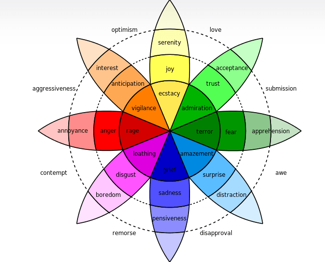
Take a look at Robert Plutchik’s famous “wheel of emotions”. It clearly demonstrates how shades of colors trigger various emotional states. Colors that are connected with happiness, for example, yellow, can increase the viewers’ willingness to share the content. You can use this color theory to provoke whatever feeling that you want in the viewer. This will enhance the user experience and make your brand forever memorable.
Color preferences by gender
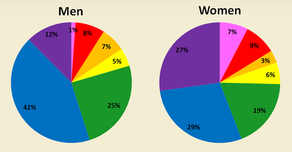
Absolutely! Men and women experience a difference in impacts caused by colors. A survey was conducted by Philip Cohen, a sociologist from the University of Maryland. People were asked about what colors influence them the most, and the results were as follows:
[Image]
- Among both men and women, blue was the most popular color.
- Men disliked violet color the most, and women disliked orange.
- Whatever color they disliked, was also considered as cheap by them.
- Tints were preferred by women while men chose shaded or pure colors.
- A huge percentage of both men and women chose cool colors as their favorite ones.
Women are blessed to see more colors as compared to men in general. They get aware of even slight color differences within a color range. This clearly explains why men call blue color as
“Blue”. While women can easily differentiate between sky, teal, turquoise, and all sorts of shades of blue.
Now how can you use all this information as a brand?
Who your target audience is? Men? Women? Or both? When your target audience is women, you have a huge scope to play with color shades. If you are selling luxury items or cosmetics, you might not want to use colors that appear to them as cheap. Men are able to take in both colorless as well as a bright color palette, as they are not much affected by the nuances of color theory as women seem to be.
Be consistent to build a brand identity
A very big percentage of the identity of your brand is forged in the way it looks. Thus, it is important to maintain consistency in your brand’s voice and the way you create content. Along with it, having a color scheme that immediately makes people connect with your brand is way more significant.
Talking about social media, the visual appearance and color palette of the content you post should be consistent. It is purposeful and provides an instant link, even if the logo is not readily recognizable.
It is not at all advisable to share any content on Top social media channels without thinking about the color schemes of your brand. If the connection is not super strong, it is fine – it should just be relatable.
It can be a bit difficult to make content with the same color scheme over and over again. And that’s when creating all the content at once helps! You can create a month’s long content at the same time and then schedule them using a social media management tool. This will save all the hassle of uploading content at different places manually.
Key Takeaway
By reshaping your thoughts on color palette, you can give your social media marketing efforts a new visual makeover. But you cannot know how your audience will react to a certain palette of color. Conduct thoughtful A/B tests to find out the color schemes to which your audience responds.
So, do you have any specific color schemes in mind? What colors do you use for your brand? Let us know in the comments below!